Pattern language: An exploration of digital printing on architectural glazing
Architectural Glazing has long been an important expressive tool which, when selected and detailed thoughtfully, can contribute to the successful transformation of architectural concepts to reality. A growing number of glass treatments have expanded aesthetic options in addition to the added performance modern insulated glazing offers.
Beyond the basics of color, tint, and reflectance, designers can further tune glazing systems through additive films, frits, and printed media to give the material an added dimension. In recent years, our practice, Graphite Design Group, has explored digital printing technology across a range of projects. In each case, the reasons for exploring digital printing arose from the unique needs of each project, but numerous common benefits can be identified:
Creative freedom. With the ability to print virtually any image onto architectural glass, there are few limits to creativity. Digital tools make the creation of even highly complex digital art within the grasp of most designers. Additionally, for most fabricators the image may be customized for each individual glass panel, opening opportunities to employ designs that use multiple panels to create large-scale impact.
Color variety. Digital printing provides a very wide spectrum of color options, and colors may be customized for each individual application. Because they are fused to the glass and protected in the IGU, colors are also very stable over time and typically will not fade or degrade. One limitation is that production techniques typically limit the application to a single color per panel, although that is likely to change over time as technology improves.
Cost. Digital printing does add a premium as compared to a comparable IGU. However, the cost is lower compared to additive building envelope elements such as external louvers, shades, or screens. As a result, digital printing can be an appealing alternative that affords a high degree of envelope design customization with a low overall system cost.
Performance. Digital printing does not substantially affect the thermal performance of an IGU. In fact, SHGC may be enhanced in some cases, although this is largely dependent on the density of any applied pattern. By comparison, additive envelope elements such as fins or shades that require through-system structural attachments may lower overall envelope thermal performance.
Silkscreen Frit vs. Digital Print
When applying graphic patterns to glazing, there are three basic technologies: graphic film, silkscreen frit, and digital print. Graphic film is typically surface-applied and suitable for short-term applications. For permanent, long-term installations fritted or printed glass are the preferred options as they do not affect the glass performance or require long-term maintenance. Of the two, a silkscreen approach is suitable where the pattern repeats, glass panels are generally uniform in size, and a manufacturer’s standard color frit may be used.
In conditions with complex, variable patterns and tight control over color is required, a digital print process will produce the best effects. Unlike a frit application which uses traditional silkscreen technology to apply a pattern that is then baked onto the glass, a digital print uses a large-format printer to apply color directly to the glass surface, which is in turn baked onto provide a long-term, stable application. Because print technology is used, the range of colors is much wider than traditional silkscreen, and patterns may be executed to a high level of detail.
Importantly, a digital print also does not rely on a fixed, repeated screen design, so patterns may be unique from panel to panel within the same project, opening up a wide range of design possibilities. The architect or design team typically develops digital artwork that may be scaled up to the size of the glass panels, and this is furnished to the fabricator for. The result is a high degree of variability of color and pattern, consistent quality control, and long-term product stability.
Some of the qualities of digital printing and demonstrations of how this technology may shape design elements are explored in the case studies that follow.
Vulcan Arbor Blocks
Seattle, Wash.
The Arbor Blocks is a pair of six-story office buildings developed by Vulcan Real Estate in Seattle’s South Lake Union neighborhood. Located on either side of a two-lane right-of-way (8th Avenue West) the two buildings totaling 400,000 sf were designed speculatively and eventually leased to Meta.
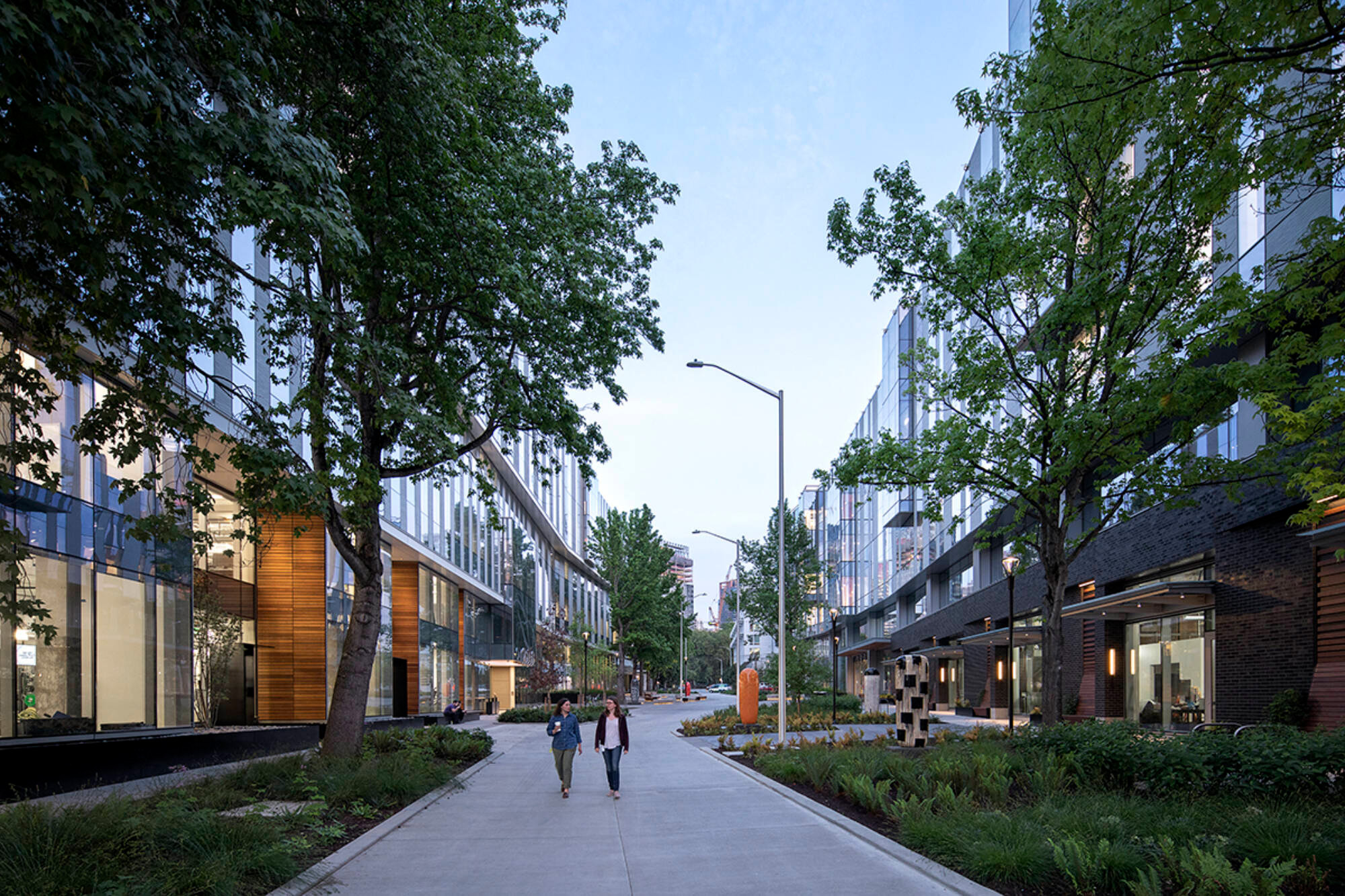
A distinguishing characteristic of 8th Avenue West are the mature sweetgum trees that line both sides of the road, and preserving and highlighting these trees was identified as a design touchstone early in the project. The roadway was realigned and designed as a shared pedestrian and vehicular “woonerf”, and the buildings were shaped with generous setbacks at mid-block on the street-facing facades, giving the roadway the feeling of a linear park.
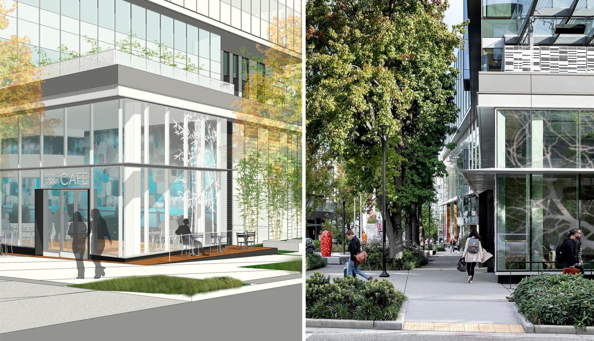
While the architectural vocabulary of both buildings is geometric and contemporary, featuring orderly façade composition and crisp angular forms, digital print techniques were employed to add a layer of lyrical, organic patterning to the facades. Specifically, in key locations on both buildings a large-scale abstraction of trees and foliage has been mapped onto the facades, facilitating a dialog between architecture and setting.
To accomplish the patterning, Graphite worked with the glass supplier and curtainwall fabricator to develop a “halftone” pattern of varying size dots that from a distance visually blend to suggest images of trees. The tree image in places spans multiple stories and across numerous individual glass panels, each of them containing a unique portion of the overall image. The dots range from 1/32” to 1” in diameter and are organized on a grid set at 45-degree angle to avoid moire effects. The pattern is printed on the #2 glass surface (inside face of the outboard IGU lite) and spans both vision and spandrel panels.
After a thorough mock-up process, a cool white color was selected for the digitally printed dots to ensure adequate visibility and a harmonious relationship with the overall palette of the project. The end effect is at once striking and subtle, as the abstract tree pattern reveals itself as one moves around the building and experiences it through varying view angles, reflection, and changing light.
Amazon Frontier
Seattle, Wash.
Part of Amazon’s Seattle Campus, Frontier is a 17-story office building with street level retail and neighborhood amenities. Conceived as an “urban treehouse”, Graphite explored themes of making, exploration, and discovery throughout the project. The use of color-printed glass was a key element of this expression.
Spanning the full width of a city block, the architectural massing is one of a tower sitting next to a smaller-scale, low-rise podium. While the podium is physically connected to the tower, architecturally it is legible as a separate and distinct element, a playful “jewel box” that is home to childcare classrooms, administrative offices, and a rooftop play area. In keeping with the active program inside, the design team sought to infuse the façade expression with a similarly active vibrant language while also referencing the treehouse theme of the project.
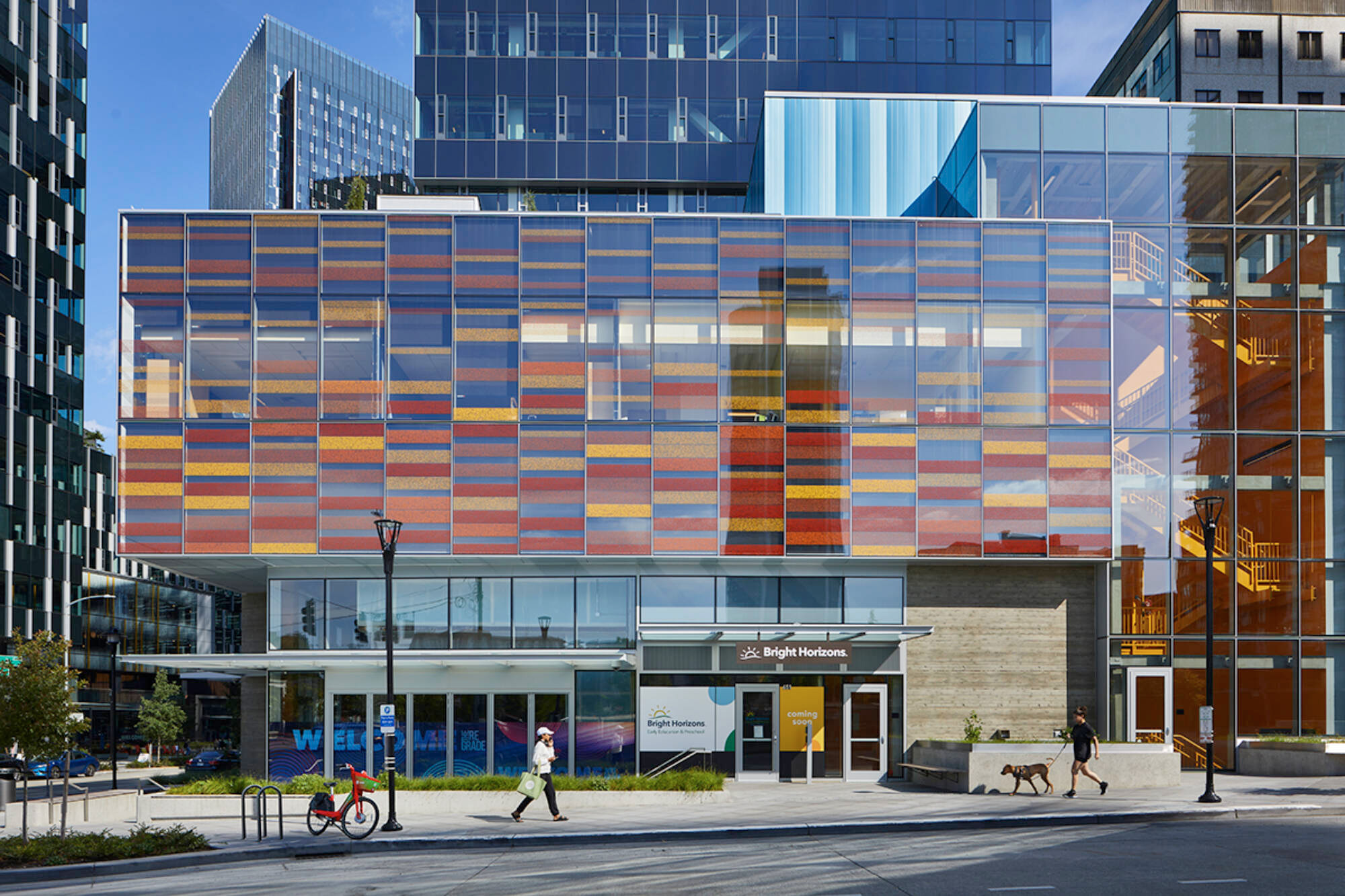
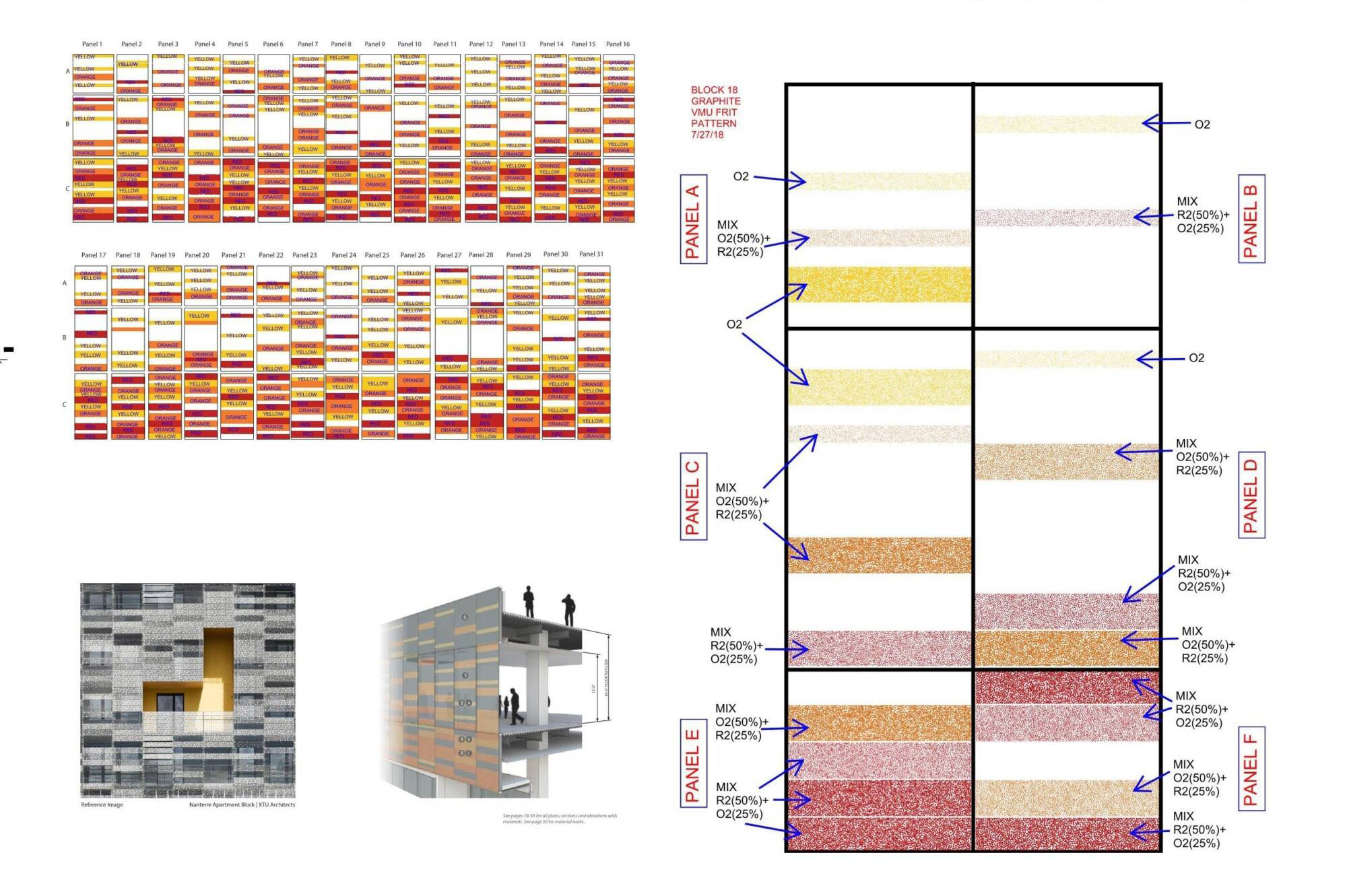
Digitally printed glass was used as the principal cladding material for the jewel box element, taking full advantage of printed glass’ ability to be customized in both color and pattern. At Frontier, three varying shades of yellow/red/orange were selected, and the intensity of these colors is further modulated by employing three different densities of square “pixel” patterns on the glass.
The patterned colors are arranged in linear plank fashion that varies from panel to panel and extends across both vision and spandrel panels. The final effect is reminiscent of painted barnwood planks or siding, laid up in seeming random order yet forming a cohesive, playful whole when seen in its entirety.
The childcare jewel box successfully distinguishes itself from the office tower’s more restrained, neutral palette while continuing the narrative through-line of the treehouse inspiration.
West Main
Seattle, Wash.
West Main is a three-tower campus recently completed in downtown Bellevue, Washington designed by a collaboration between Graphite Design Group and Compton Design Office. Long viewed as a suburban companion to Seattle to the west, Bellevue has come into its own as a vibrant, diverse community that is home to numerous global technology companies.
Developed by Vulcan Real Estate and leased by Amazon, West Main is a key project in Bellevue’s downtown evolution, as it blends high-tech, high-performance office space with community-focused design features that help tell the story of this place once home to forests, farms, and fruit orchards. Thoughtful use of color and digitally printed glazing helps tell this story.
During early design investigation, it was learned that the site of West Main was once home to a small watercourse—Meydenbauer Creek—that traversed the hillside site as it meandered to its final outlet on nearby Lake Washington. From this the architectural concept of “flow” was derived and is manifest in the project at numerous scales.
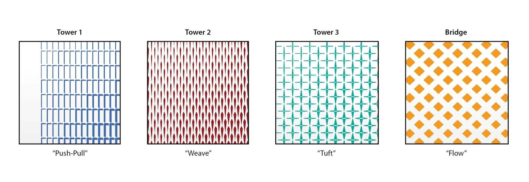
Each of the three towers that comprise the project adopts a subtly different window pattern that modulates across the facades, tied together with an overall flow gesture that legibly traces its way around all the outward facing tower elevations. Further, each tower is anchored by a full height mosaic wall sheathed in over 60,000 stainless steel tiles, shifting between blue, red and green hues from towers 1, 2 and 3 respectively.
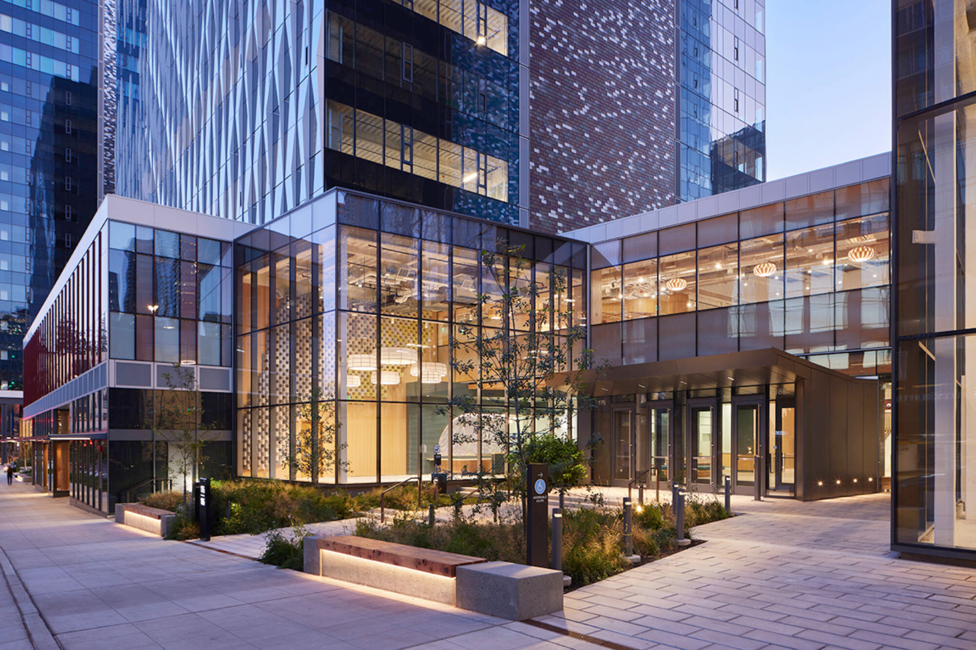
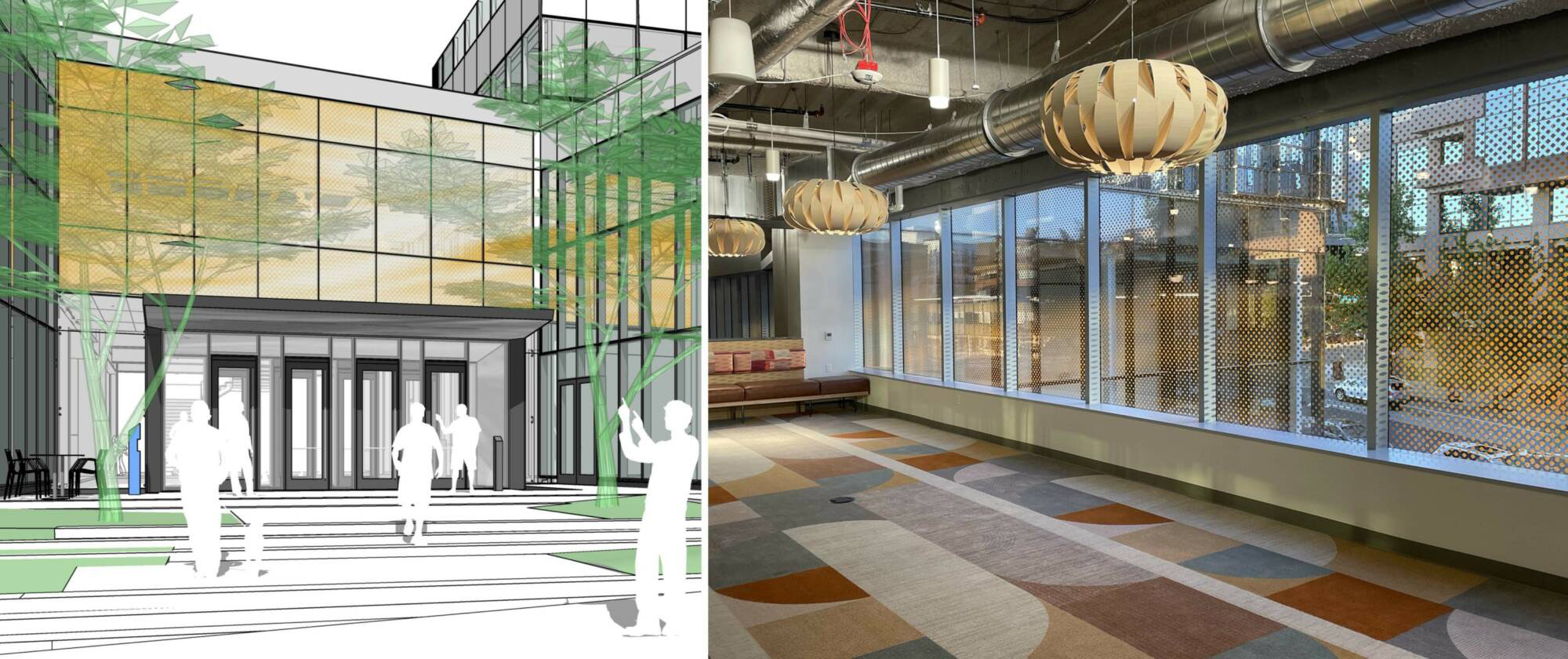
It is at the podium that colored, digitally printed glass continues the color and flow narrative. Street-facing facades at levels 1 and 2 were mapped with a large-scale supergraphic pattern unique to each tower. Similar to a halftone, seen at a distance the individual pattern elements merge together to create an abstract flow pattern that varies in scale and density, tracing a unified flow gesture around the project.
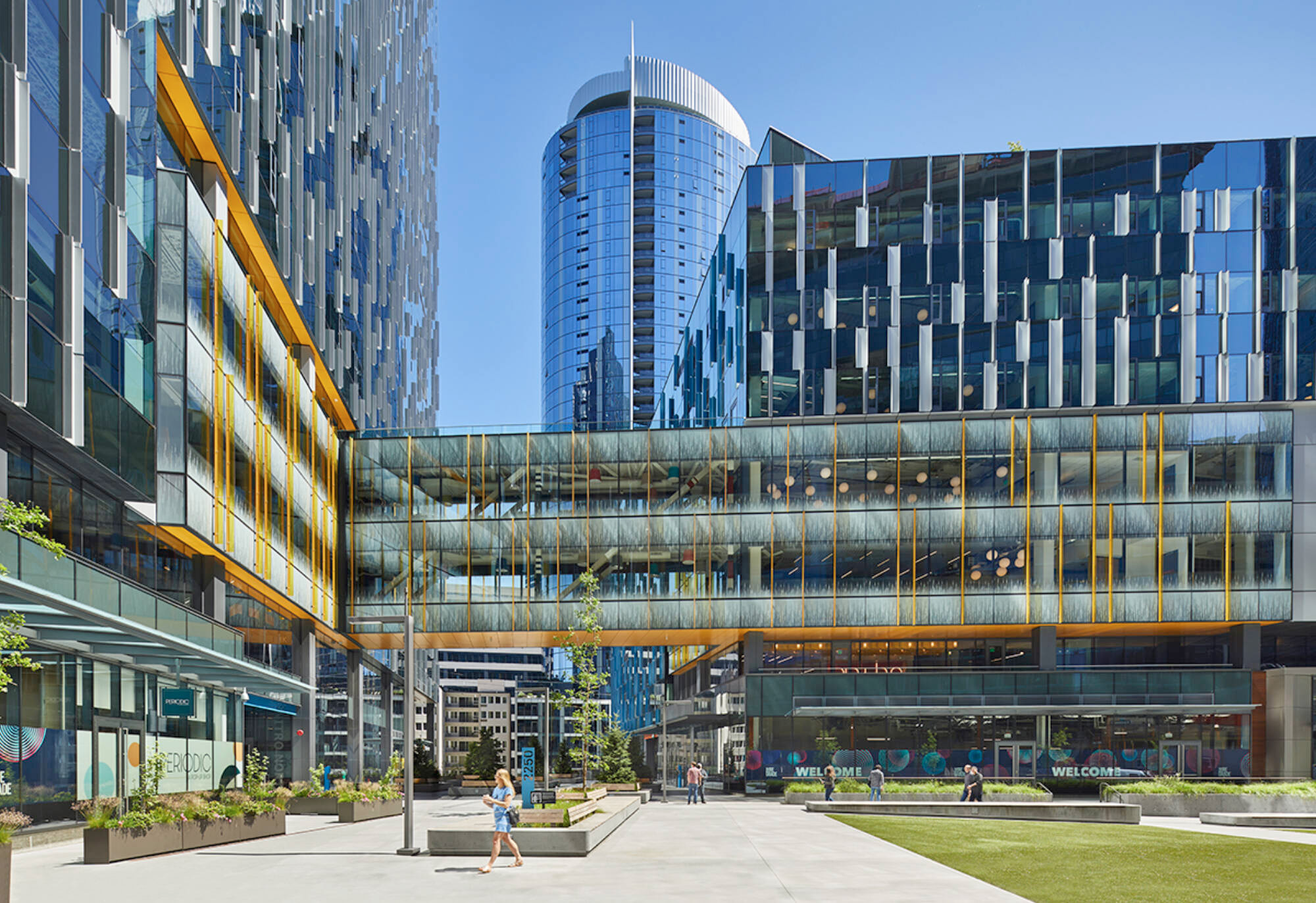
Patterns are aligned with the color palette of each tower—blue, red, and green—and the geometric elements that make up each pattern use shapes were inspired by the curtain wall modulation found in the towers above. At the primary entry, where two towers are linked by a bridge at level 2, a fourth, orange color is introduced on the bridge, further emphasizing this area of arrival and connection.
Lessons Learned with Architectural Glazing
As these case studies illustrate, digital print technology can be employed in a variety of ways to extend a design teams’ toolkit and highlight desired architectural features and experiential qualities in new and innovative ways. There are a few important things to keep in mind when considering using digitally printed glass:
Mockups are essential. Digital tools are indispensable for designing glass patterns and testing color effects. These simulations, however, should not take the place of a full-scale mockup of any significant design element, including colored and printed glass. Further, the design team should endeavor to review any mockups in a variety of light conditions and orientation to ensure that the final build will maintain the design intent.
Glass types matter. The effect of the same digital print on tinted, colored, or reflective glass may be dramatically different from one application to another. Printed patterns are generally more legible on clear, untinted glass. However, it is feasible to print on glass with low-E or reflective coatings, assuming the selected glass manufacturer has this technology, which should be vetted early in the design process.
Prioritize early coordination with glazing supplier and fabricator. Glazing fabricators are frequently the best resources for defining the parameters of what may be achieved through printing technology. This may change from one fabricator to another, so where feasible it is best to identify the preferred fabricator early in the project and work with them directly in the design phase to inform selection of print, pattern, and glazing.
Be mindful of lighting and reflection impacts, both day and night. More than any other material, glass appearance can change dramatically in different environmental conditions, including orientation, reflected context, and presence of interior, direct, or ambient light. Printed glass is no different, reinforcing the need to mockup and evaluate all potential design conditions beforehand. Further, the effects at night and interaction with both exterior and interior illumination deserve thoughtful consideration and mockups where appropriate.
Consider the effects on the interior environment. Glass is inherently two-sided, so considering what an occupant views from the interior is essential. Dense patterns of dark colors may significantly affect outward views from the building and quantity of daylight reaching the interior. Bold colors may affect the interior experience and should be thought of in the context of any interior finishes that may be adjacent. Some fabricators have the technology to perform a “double pass” print where a layer of white is printed facing the interior prior to any exterior-facing color application, effectively neutralizing any interior color effects. However, the efficacy of this may vary with color and pattern and may be especially difficult to achieve with very fine patterns made up of small graphic elements. If this technique is pursued a mockup is strongly recommended.
Conclusion
As the examples discussed here illustrate, digital printed glazing opens myriad creative opportunities to enhance architectural expression. As its use in architectural fenestration expands over time, technology improves, and costs trend downward, we are certain to see new and innovative ways to use this emerging technology. Understanding the technological and compositional and possibilities of the product is essential, but with the right knowledge, process and fabrication team design possibilities are boundless.
The post "Pattern language: An exploration of digital printing on architectural glazing" appeared first on Building Design & Construction

